0 Comments
There are so many great drawing challenges that happen each year and often I find out about them too late! So I have created a list of challenges below so you don't miss out! In the first week of January I took part in a lovely art challenge, 'Cats in the Garden'. Each day there was a different prompt. Challenges like this are hosted by @TheyDrawAndGarden often and are so fun to participate in. 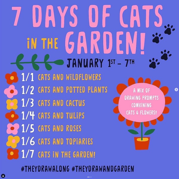 Day 1 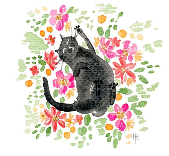 Day 4 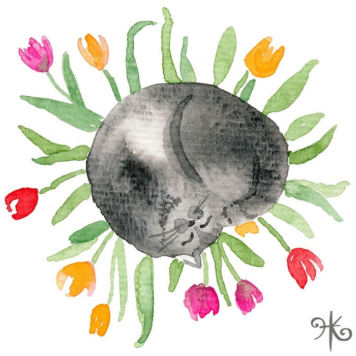
Day 6 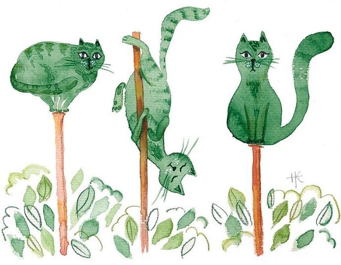 Day 7 I don't always have time to do every single day in a challenge, so I might just share some work that I've already finished.  If you're interested in doing illustration challenges, here are some great ones that happen at different times during the year.
Ongoing Challenges:
Annual Challenges by month:
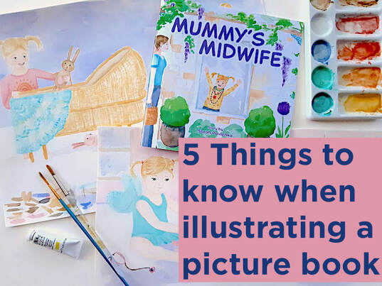
If you want to illustrate your own picture book or are thinking about taking on an illustration project, here are some things to consider to help you quote accurately, plan efficiently, and have a lovely finished product. 1. Time The most important thing I learned is that illustrating an entire book is a time consuming project. However long you think it will take, it'll probably take 50-100% longer. We always overestimate how much we can get done, and this project was no exception. Generally picture books are 32 pages including the end pages. That's a lot of pictures! I worked on the book in between other projects and spread the work out over about 12 months. 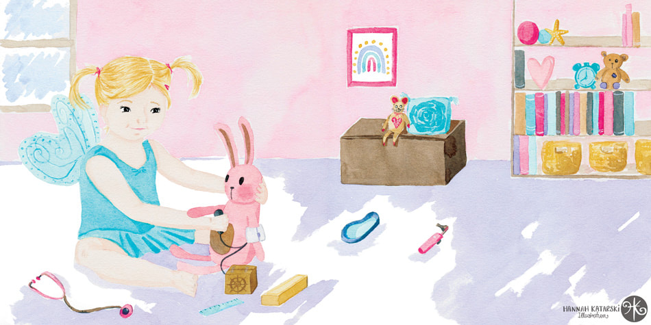
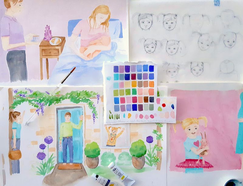
 3. Continuity When working on one-off illustrations, continuity isn't a thing. But a book is one, cohesive work, so the artwork has to be cohesive. One of the important factors in achieving this continuity is the colour scheme. The other obvious one is the style of illustration. The third element is a bit trickier - keeping the characters consistent. This means that the little girl (pictured above) looks like the same little girl on all the pages. Whether she is facing side on or front on, happy, sad, laughing; she needs to look like the same person. She also needs to look the same age. This means getting the facial features just right can be pretty time consuming. You may notice that characters sometimes have the same clothing throughout a book. This helps us quickly identify them as we read. It helps with continuity. In Mummy's Midwife, I wanted Harper to have lots of different outfits because little girls often love playing dress-ups. This meant I introduced other elements to help her look the same. She always has pigtails and a clip. 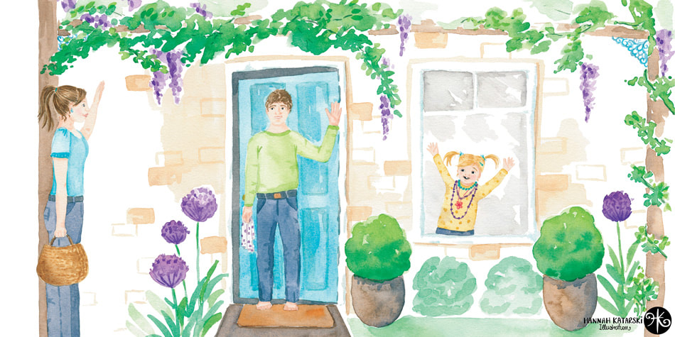 4. Revisions/Art direction Circling back to 'Time', there will be a number of revisions that need to be made at several stages throughout the project. From composition, to character tweaks, to colour changes. Communication is key as well as being a good project manager. It is important that you seek feedback at each stage and incorporate it before moving forward. It also needs to be made clear that once that project stage is complete, it is done. When working with traditional media, changing all the colours after painting isn't really an option, unless the budget is altered to allow for a full repaint. 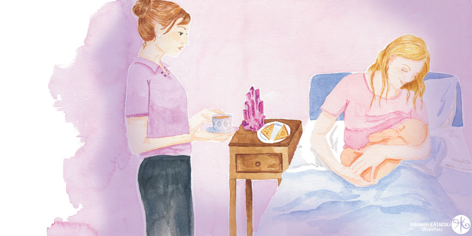 5. File setup It's really important to know the book format from the outset. What size and orientation will it be? Also, what format will the artwork be required in order to be integrated with the rest of the book? Will it need to be converted to CMYK or will the Printer convert from RGB? You might need to leave a certain allowance/overflow around the edge for trimming (called a bleed) and you may need to allow for the gutter (where the binding/stapling happens) I set up my colour roughs at 300dpi in procreate so I could print them out fuill size. I then painted a double spread on an A3 page. I then scanned at 600 or 800 dpi to ensure I'd have the correct page size at 300dpi (print quality). Depending upon your arrangement, someone else might scan and clean up the artwork. But on a small project you would likely be doing that. Ensure you discuss this and quote accordingly. Seeing the artwork come together with the text and full layout is a real milestone. Ideally you will see a proof so you can liaise with the book designer/client about any tweaks that are needed to colours or vignetting around artwork. Illustrating a book has been a challenging and incredibly rewarding project. Whether you are planning to illustrate you own book or have been asked to work on someone else's, hopefully this article helps you consider some of the important factors for success.
Have experiences you'd like to share? I'd love to hear about them below.
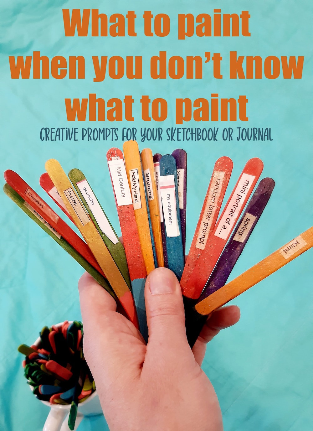
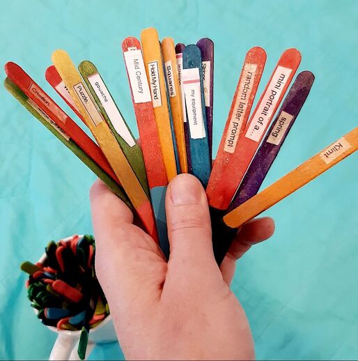
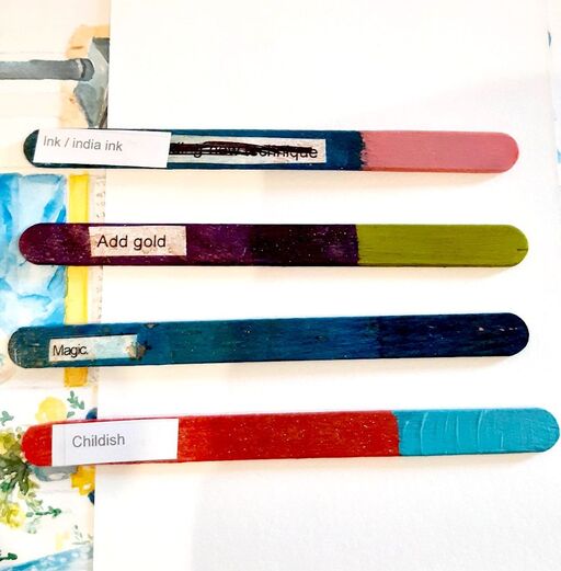
With that out of the way, I'm giving you 3 fun ways to spark your creativity and get painting. I even have a list of ideas for you! Use this technique when you want to try something new in your journal or sketchbook. When you want to be inspired or challenged to try something new. It's also a great way to try all those new art materials that you haven't opened.  Prompt picker #1
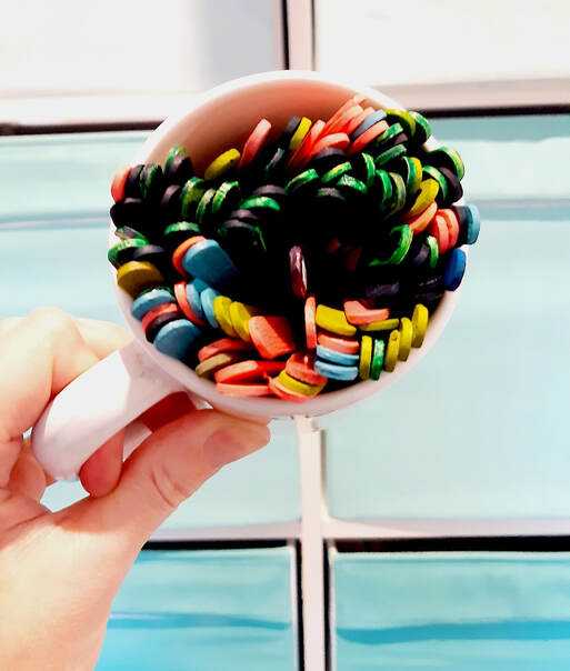
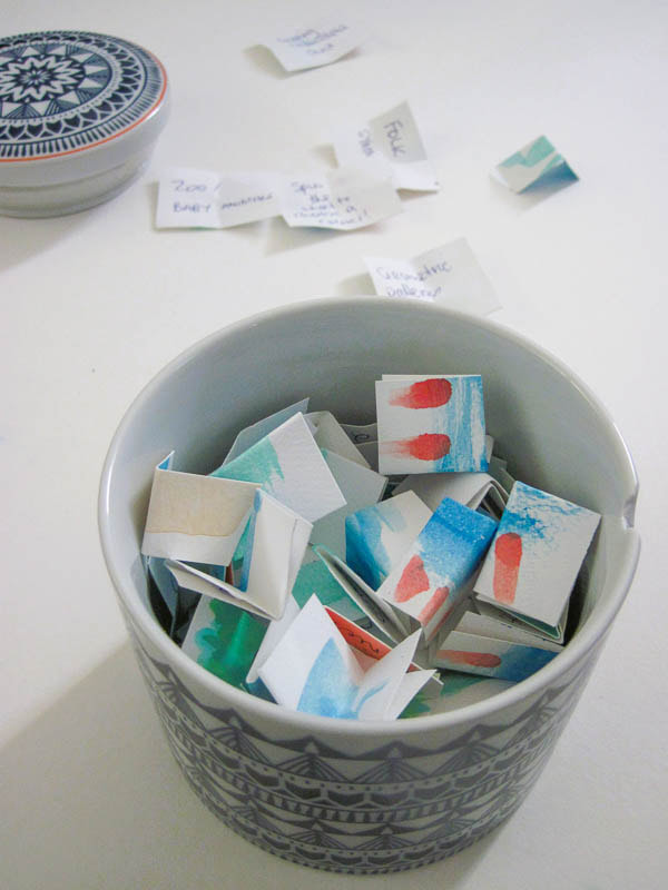
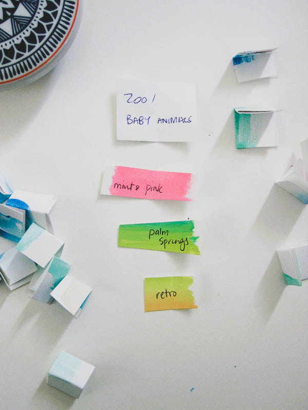
 Prompt picker #2Write each idea on a small square of paper and fold them up. Keep your ideas in a nice jar. You can easily add new ideas to the jar as you think of them. You can even colour code them, as above, so you can quickly pick a subject and a colour, for example.
Prompt picker #3If you love lists and option 1 and 2 just seem like hard work, use a random number generator (or a child!) to help you choose. Create your list of materials you want to try and objects you want to paint. Ideally number each row. Then simply plug in your total number of rows into the number generator and away you go.
Eyes on the PrizeOnline classes are wonderful and SO inspiring. Plus there are a lot of free ones too! But sometimes, when you are short on time, you need to spend that time doing, not watching someone else. After all, it's the practise that helps you learn. Don't fall down a YouTube rabbit hole to find that it's time to start dinner and you still have a blank page. 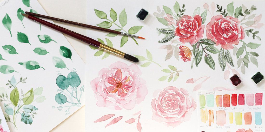 Free ideas list to get you started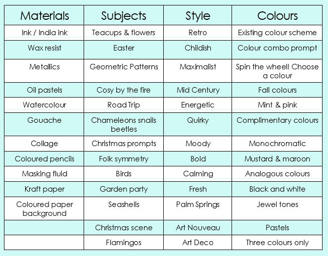  I'm happy to be presenting this full day workshop once again!
This professional development workshop is for artists, photographers and creatives wanting to make more money from their art. Do you love making art, while the business side of your practice gets ignored? Not sure how to secure an exhibition? Overwhelmed by the word ‘marketing’? Then this one day workshop is for you. "Do I need a website and how do I sell my art online? How do I get noticed? How do I talk about what I do?" These questions will be answered in this full day workshop as presenter Hannah Katarski walks you through important aspects of running your art practice as a successful business, so you leave inspired and with an action plan for what to do next. You will learn: • How to talk confidently about what you do as an artist. • Identify and find your audience. • Ways to generate more opportunities for your artistic business. • Social media and eCommerce - what you need and what you don't. The seminar is taking place on Saturday, 18 June and s kindly subsidised by the City of Stirling.
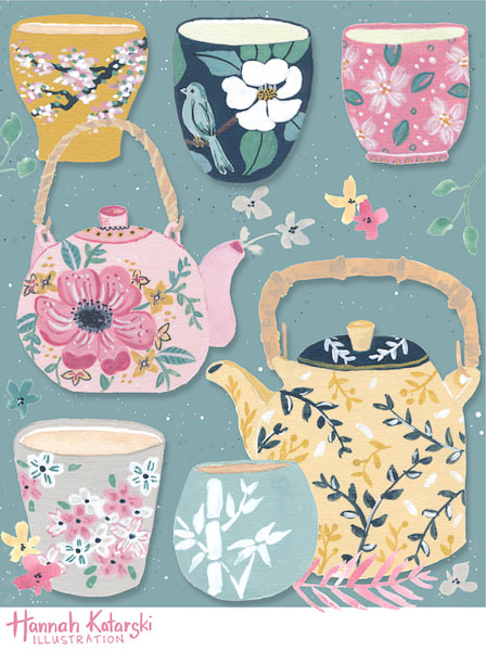
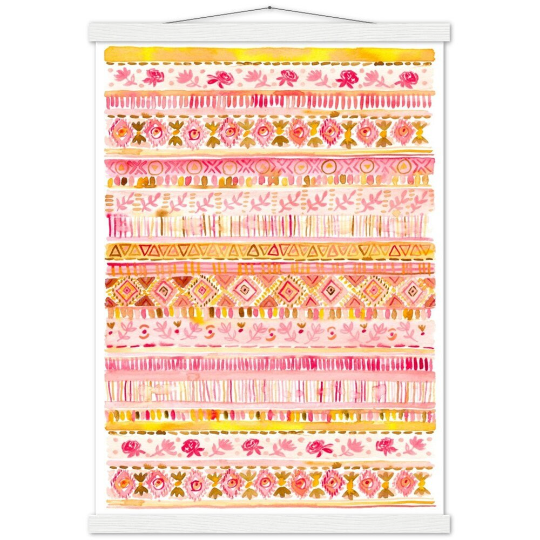
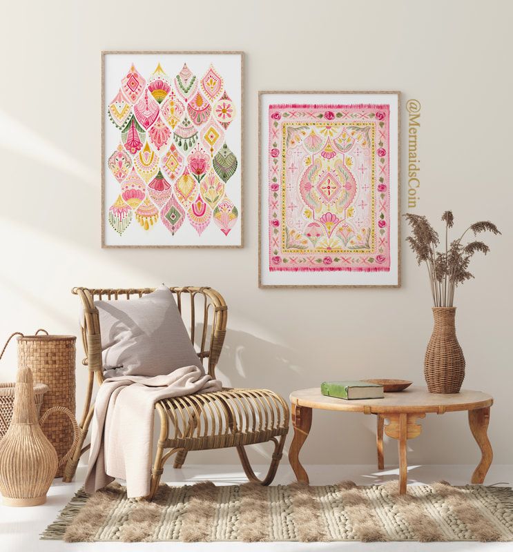
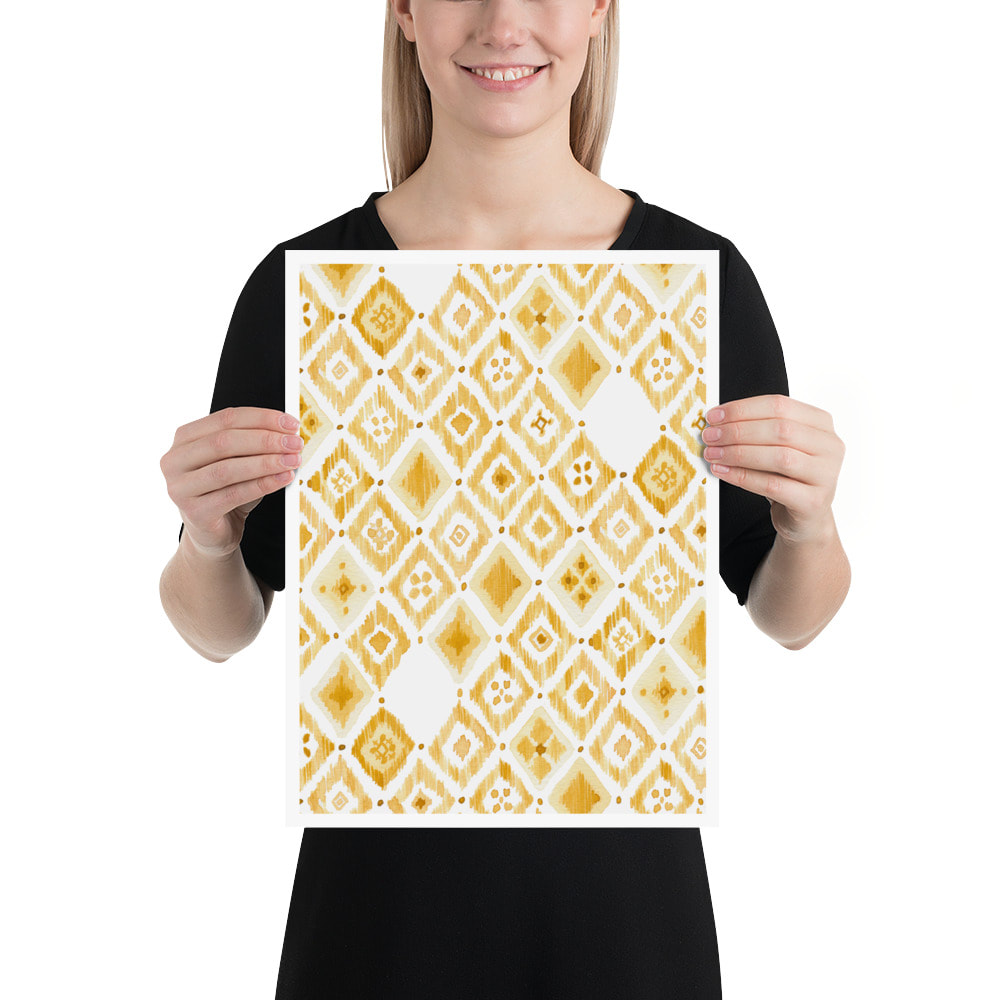
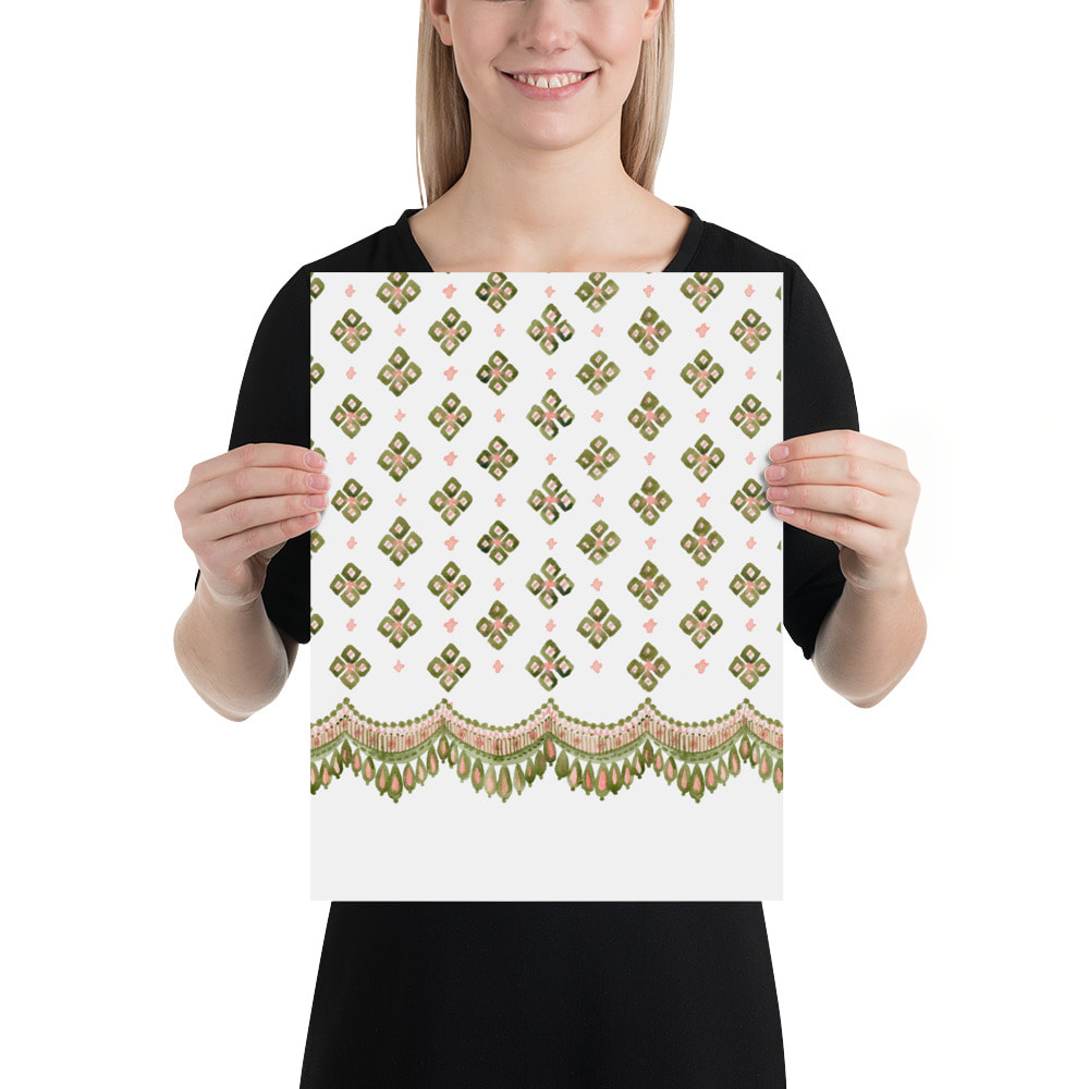
My latest collection of watercolour art prints are designed so that you can mix and match them to create a beautifully curated gallery wall.
Choose from a number of 'hero prints' and monochromatic coordinates which pair beautifully. They are available in a range of sizes to suit your wall size and decor. The watercolour details were inspired by antique textiles. The originals were carefully scanned to create a museum quality art print. 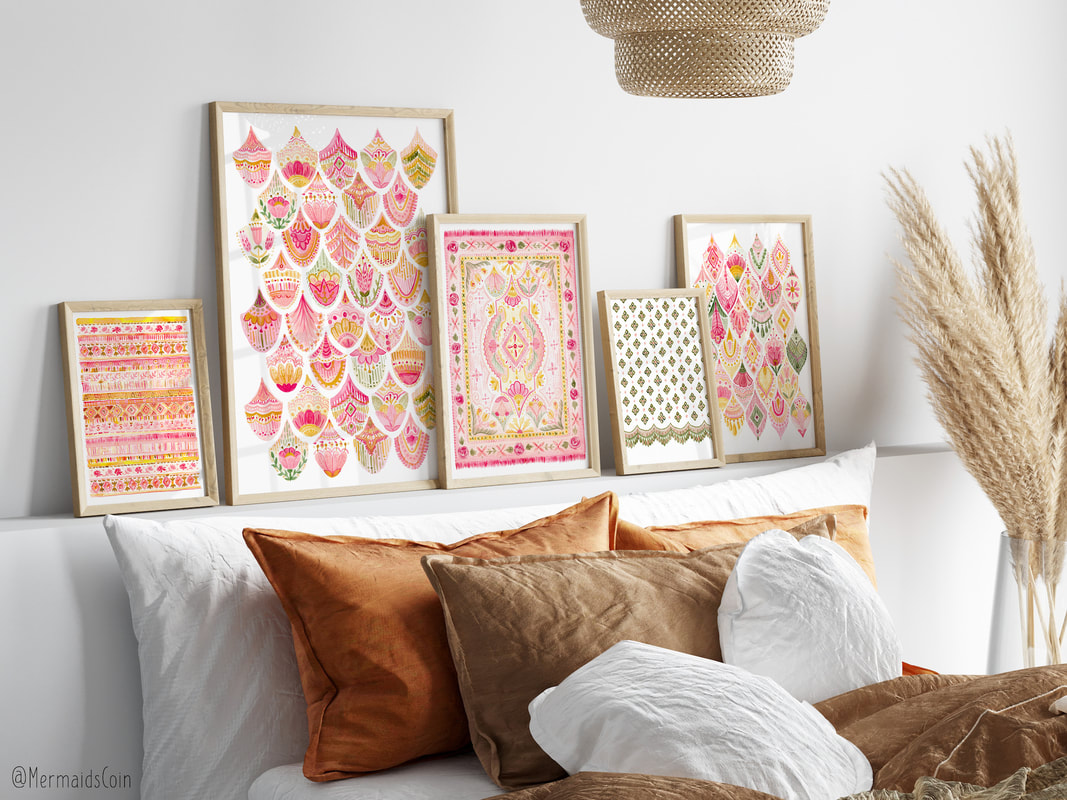
Due to Covid impacts, I've now partnered with a number of printers so that my artwork can be shipped from 5 locations worldwide. This means you get your artwork quickly with a smaller carbon footprint. Print locations include Australia, US, UK, Canada and Europe.
I recently discovered the Room Portrait Club and have joined in with some of the challenges.
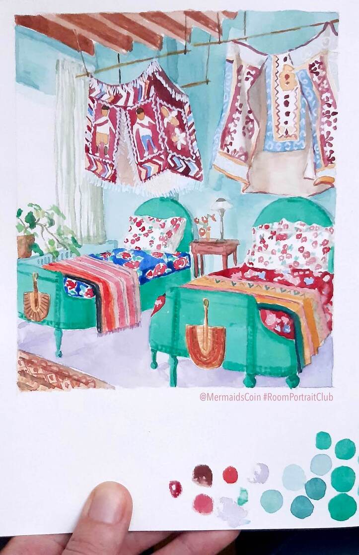
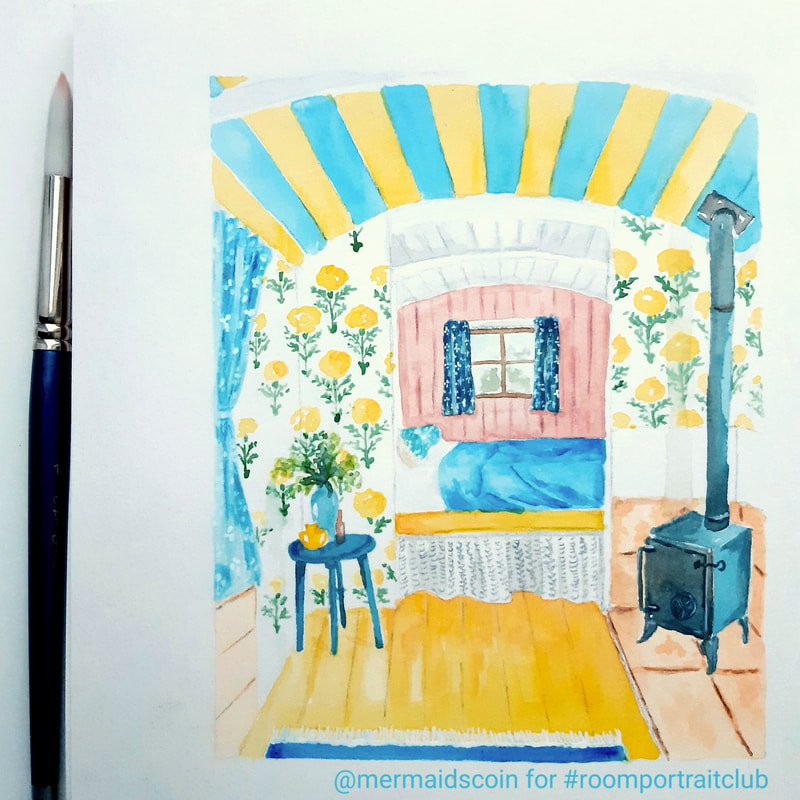
Room Portrait Club is a supportive, instagram community where artists complete a weekly portrait challenge using their chosen medium. A new image is posted each Saturday and artists from all over the world share their take on the room's portrait. What I love seeing is the variety of media! There is painting, of course, and sketching, but also collage, printmaking, assemblage and embroidery. It's really inspiring. Some portraits are realistic, whilst others are graphic and some artists choose to reinterpret or just depict a section of the photo. ​ Here's my room portrait from a few weeks ago. A gorgeous little shepherd's hut interior, complete with William Morris wallpaper! 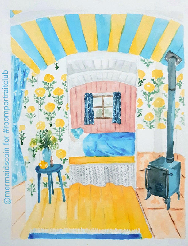
I've been working on improving my perspective sketching and this image certainly challenged me.
​The image for the following week didn't inspire me as much, but I loved seeing the work of the other artists. 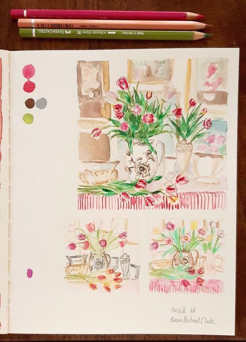
I LOVE this week's image, because of the colours. I didn't manage to squeeze it in before the deadline, but you can see my version below.
Be sure to check out #roomportraitclub on instagram.
If you are interested in joining in but don't know where to start, check out my online class where we paint a living room portrait with gouache and watercolour for our project. 
"Scheherazade" is my new jewel-toned, geometric art print available in sizes from 8x10" up to 28x40"! This beautifully feminine artwork is dramatic and evocative of another era. It is the perfect artwork to elevate any room. Position it above the master bed, in your boudoir, or give it pride of place in a bold living room.  I hand paint all my patterns with watercolour, building up layers and lush details. I then scan the finished artwork to create repeating patterns and a range of giclee art prints. 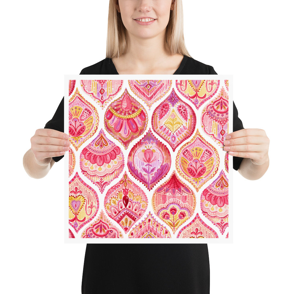 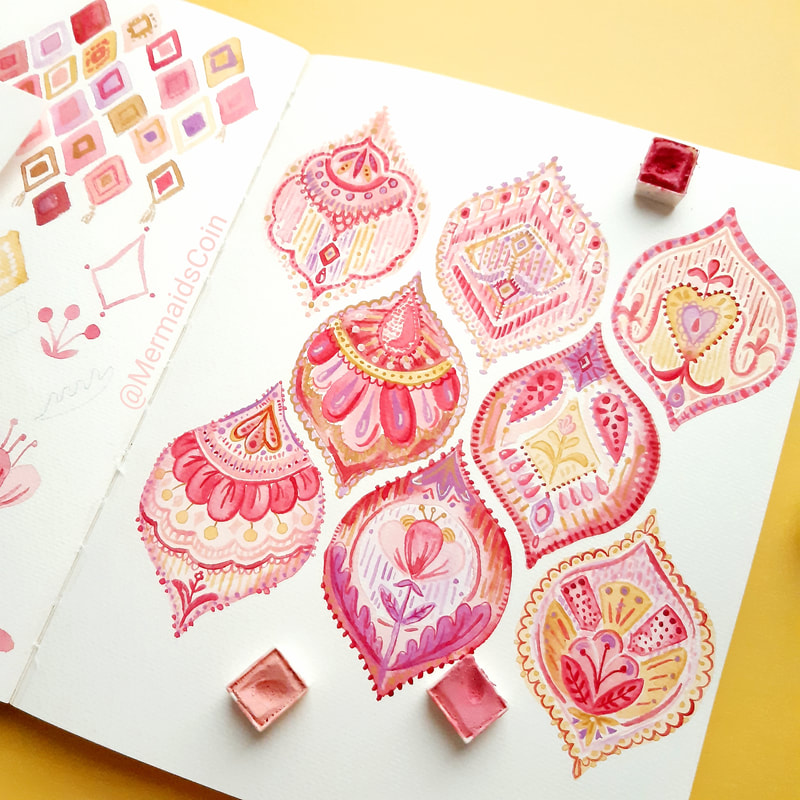 This design is also available to license on fabric, apparel and in other markets. Email me if you are interested.
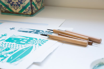
Printmaking is such a diverse discipline and a 'print' can mean lots of different things. Often you hear 'print' meaning giclee prints or digital reproductions of an original painting or illustration. Most of my works are dry point prints. Each one is made by hand, painted by hand and then signed and numbered - as they are limited edition. First, I start out by sketching my design until I'm happy with it. I then transfer my design onto illustration board, which will become my 'plate'. I cut out my plate, seal it with up to 6 coats of sealer, and then I etch all of the lines of my design into the plate with a sharp tool. 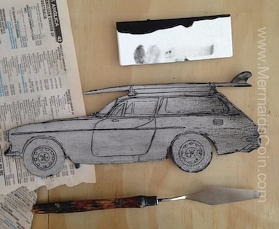 My next step is to 'ink up' my plate ready for printing. The ink goes on and then the excess ink gets gently wiped off, leaving ink in the etched lines. This is the most time-consuming part of the process. When I'm happy with the plate, it goes onto the etching press. My paper goes on top and I hold my breath and wind it through the press. 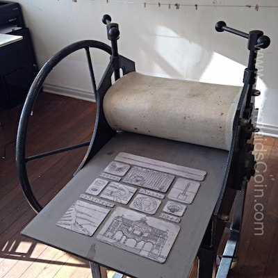 The prints are left to dry. To make the next print, I ink up and wipe off my plate again. Plates made in this way can only go through the press limited times and so each of my designs will be limited to /15 or /25 prints in an edition. When you see a number on the bottom of an artwork like: 2/25, that means it was the second print pulled in an edition of 25. U/S stands for Unique State and means that the print is unique, either due to ink colour, layout or the watercolours used. 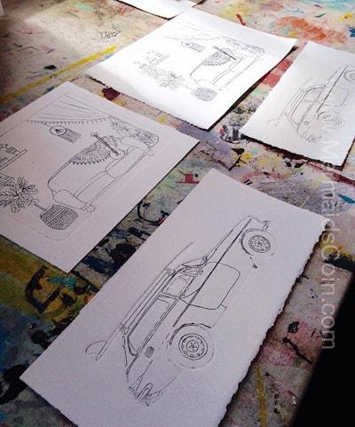 Once the print is dry, I paint it with artist quality watercolour paints. The colours that are mixed can never be recreated exactly, so each one has its own unique quality. 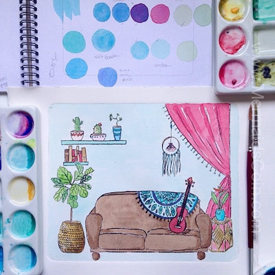
I am excited to share my new collection of four pretty, pink prints! I have loved painting this collection. I started off painting the woven pattern and then moved on to the scallops. It was really freeing to have a repetitive structure and then be able to try new things in each shape or line. I've been inspired by lace, beading and antique chintz, theatrical costumes and colours of Venetian glass. 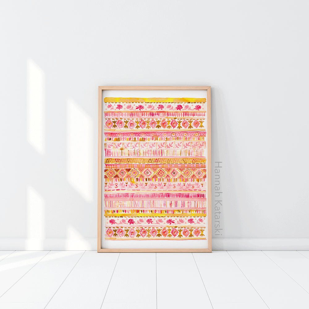 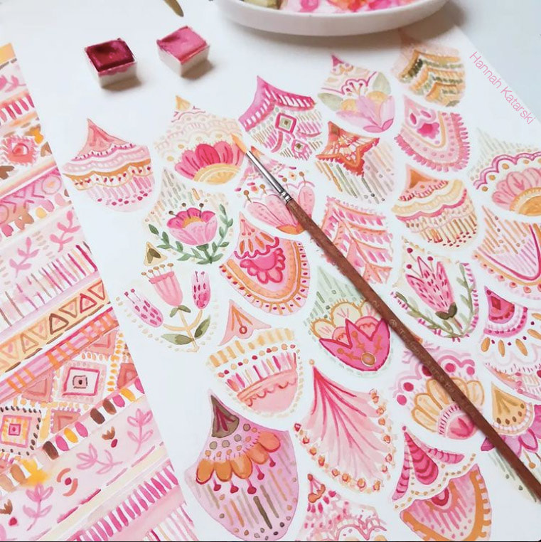  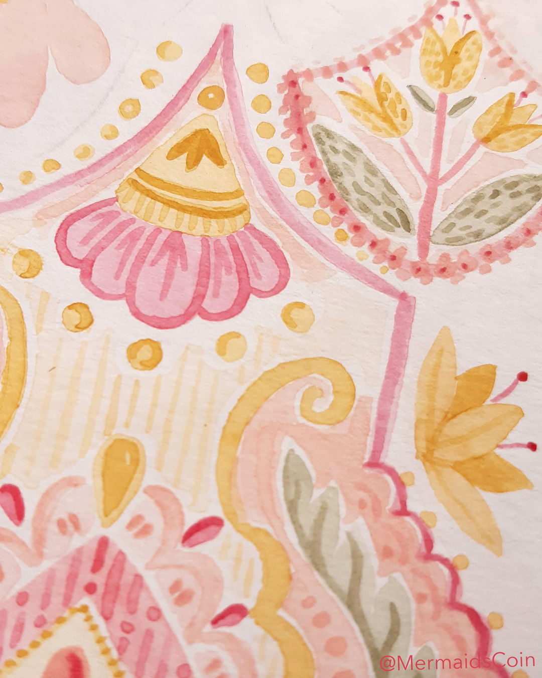 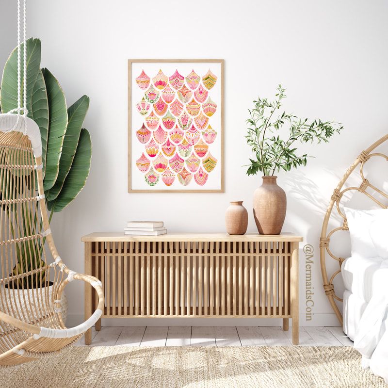 I'm so proud to launch my latest print, Parisian Summer. 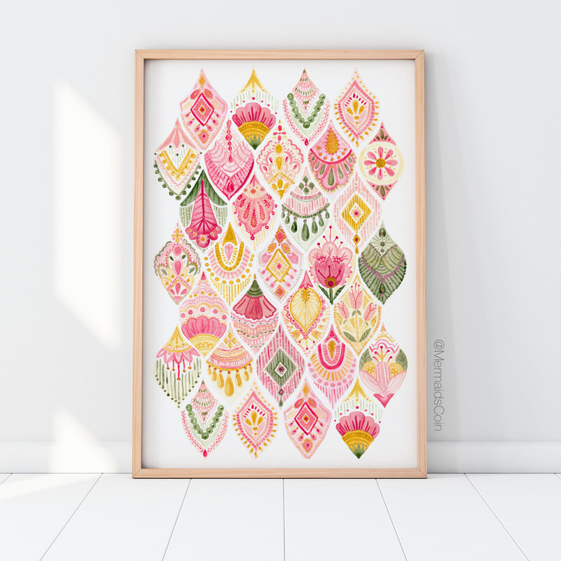 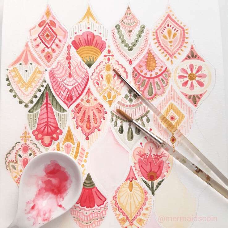 I am really enjoying exploring this idea. I've been inspired by lace and antique chintz, theatrical costumes and colours of Venetian glass. 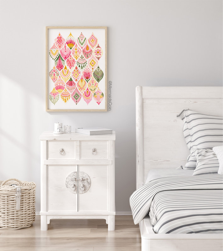 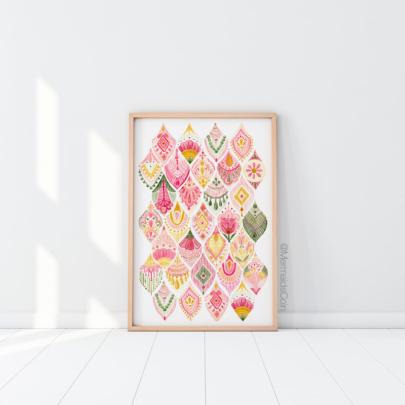 This artwork is printed at museum grade quality and available in US and European sizes, from 8x10" and A4, all the way up to 70x100cm! 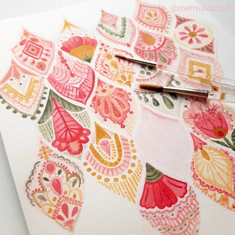 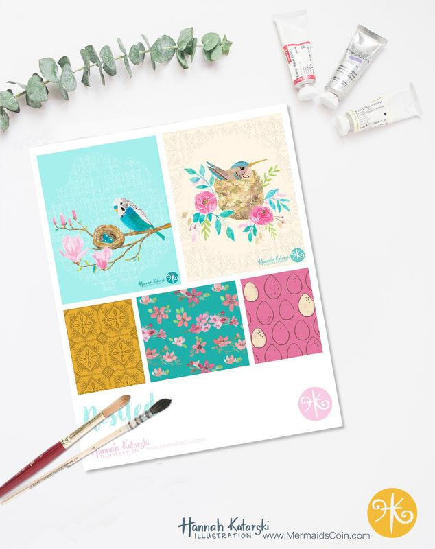 I love taking online classes. Victoria Johnson's are some of the better ones I've done. She provides succinct, useful information and then great briefs from which you can launch into new work. The classes aren't about learning techniques, but building concepts and ways of thinking. Her Create Collections class got me thinking about leveraging all the ideas I have to create a small series. This is far more efficient than creating five unrelated illustrations. I do love working this way, because sometimes I feel this need to include all my ideas in one design! I don't want to leave anything out. A series allows you to explore as many as your ideas as you want to. 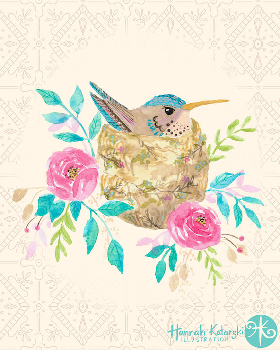 For this collection, I combined florals and something new to me - birds. It was great to take on a new challenge an fun to create some simple coordinates to fill out the mini-collection. 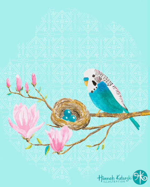 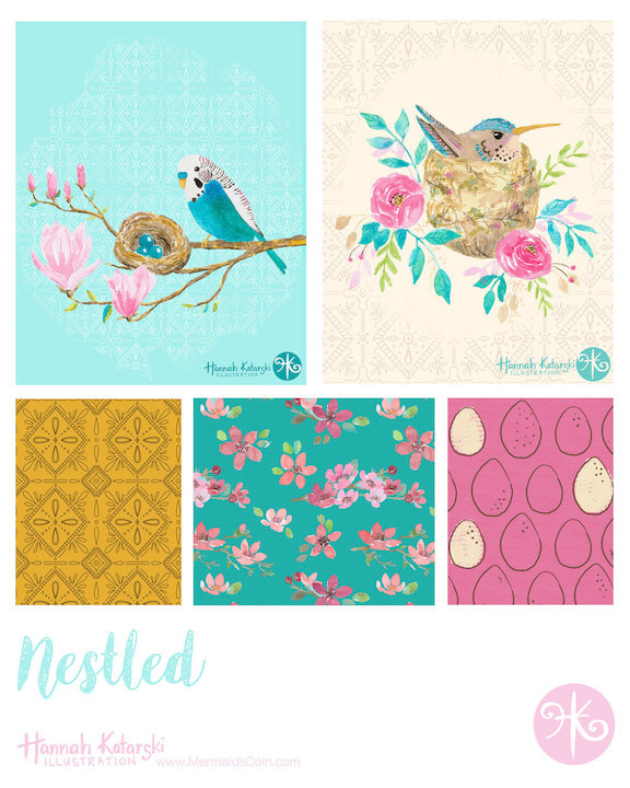 These designs are all available for licensing.
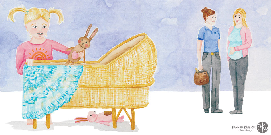
Last year I finally took the plunge. I had been building my illustration portfolio for maybe a year, and was getting prepared to start approaching art directors. The first market I was going to try my hand at was editorial. This can be book covers, magazine covers, spot illustrations... the kind of artwork that accompanies text. So I had been adding artwork to my portfolio that included people and children, in order to show that I could do the work. I wrote my email pitch and started introducing myself. I tried to keep my hopes realistic. After all, it's not like someone was going to get me to do a cover, but hopefully a couple of spot illustrations would come my way. The very next day, I got an email from Mindful Parenting Magazine. The artist they had lined up for the next issue was unavailable and would I like to do it? YES! I would! 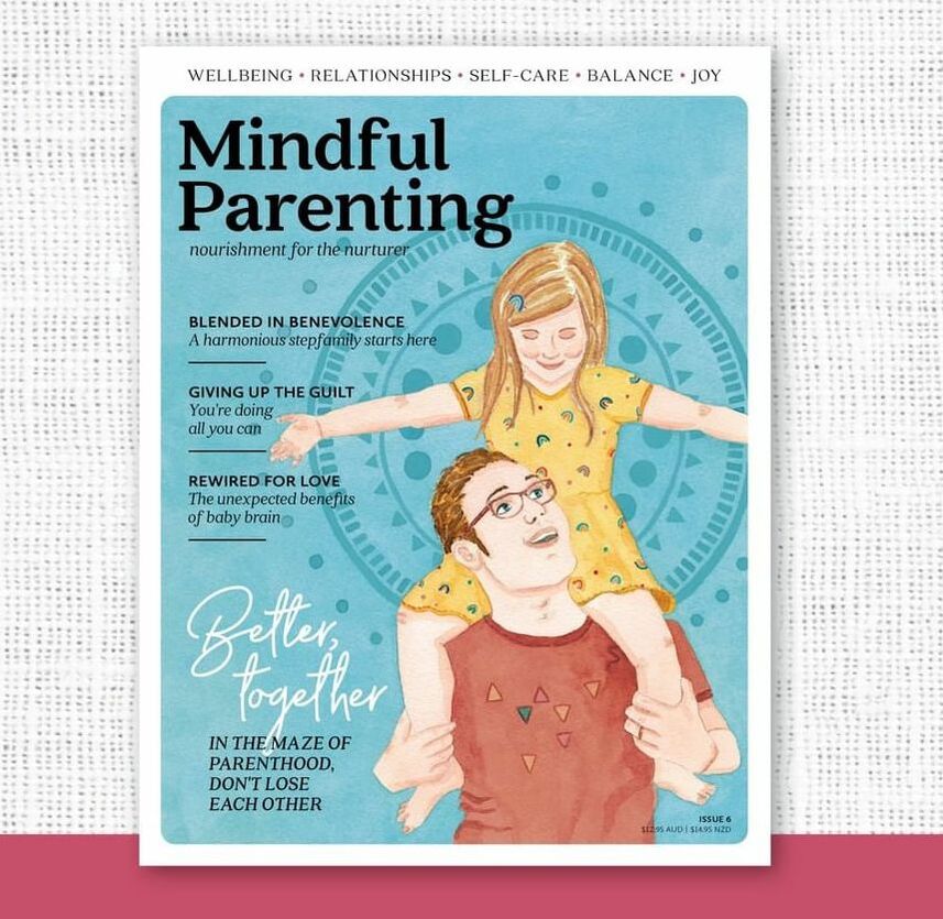 They send me a fab brief and a contract and I got to work creating some concepts. Once they had chosen their preferred sketch, I created some colour roughs for them before painting the final artwork. 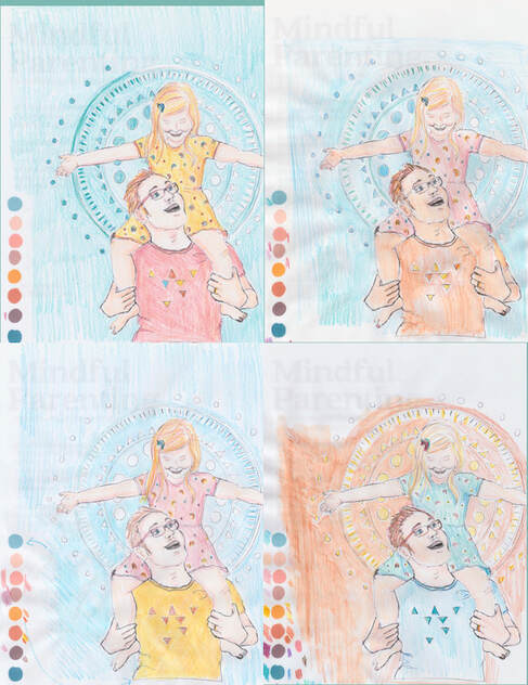 Lessons LearnedThis was such a dream project. I also learned some lessons along the way. Communication is key and art directors and designers need to see what is in your head as much as possible. This is always difficult with painting, when the only way you can really show what the artwork will look like is by painting it! For this project I created colour roughs with coloured pencil. I have also created them digitally, but for subsequent projects I'll be creating thumbnail colour roughs using paint. Thumbnails are small sketches with minimal detail and therefore faster to complete, while still communicating colour and feel. Colour pencil didn't communicate the saturation or texture of watercolour. I have tried digital roughs but then need to mix my paints anyway. The added bonus of using paint is that when I get approval, my colour mixes are ready to go.  This image was licensed exclusively in 2020, while that issue was new. It is now available for licensing.
At the beginning of 2021 I had a list of goals for the year. One of them was to get my work on a jigsaw puzzle. 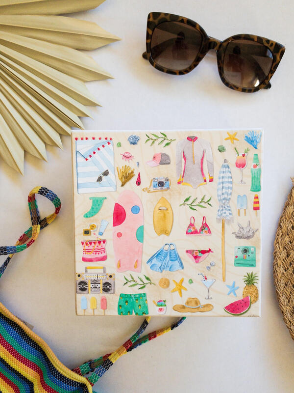 I'm unbelievably excited to share my latest collaboration with you! "Beach Essentials" from Surf Shack Puzzle Co. This was a match made in Heaven! Owner, Mahina is a fellow surfer who started Surf Shack Puzzles last year. I approached her about working together and she was full of wonderful ideas. This first puzzle was an adaptation of an illustration in my portfolio. I painted some additional icons to add more detail to the puzzle. Mahina was wonderful to work with and I love that she promotes female artists across the world. Surf Shack Puzzles are made from recycled materials, come in plastic free packaging and are printed with non-toxic inks. 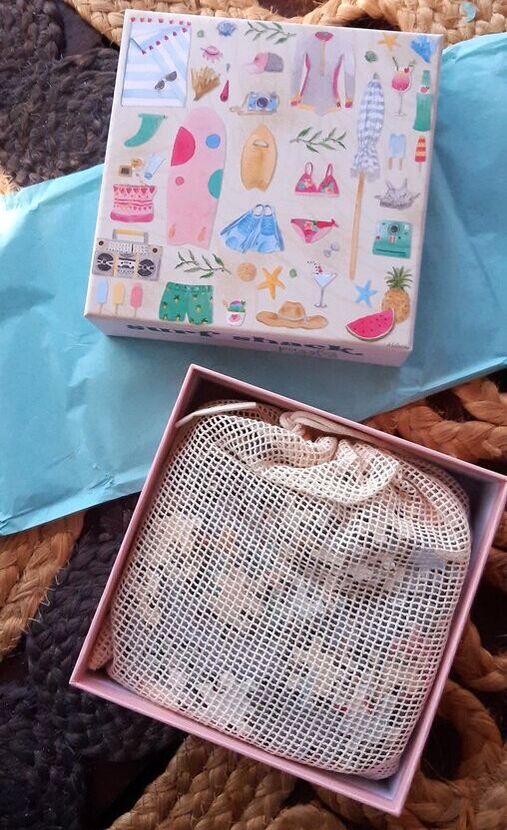 I created the elements with watercolours before scanning them and tweaking the arrangement in Photoshop. I kept to a colour scheme in order to make everything coordinate. (I talk all about this in my online class.) 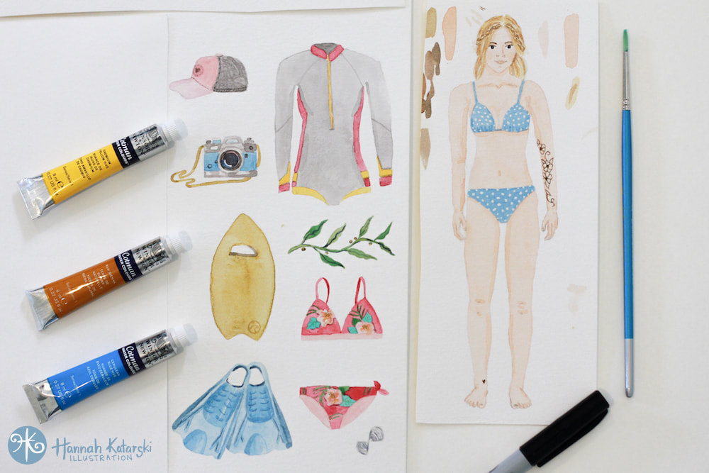 I just love that there are so many avenues for illustration to find its way onto products. My second design will be launching with Surf Shack Puzzles a little later in the year. Sign up for my newsletter to be the first to hear about it. 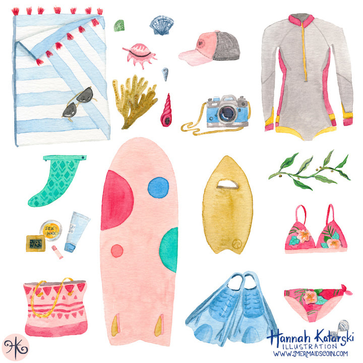 I love painting and I also love surfing. So I love to combine the two wherever I can! Read on to learn how to create a cute paper doll with changeable outfits. Paper dolls are so nostalgic of our youth and have a long history. Your doll can be a mini-me or inspired by someone you know, or completely fictitious. 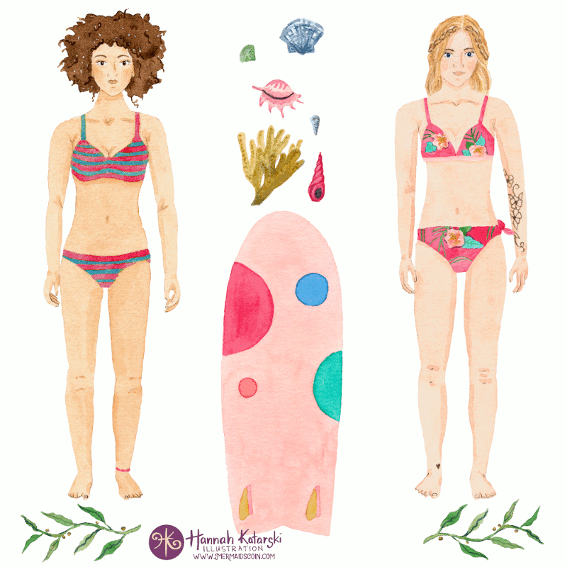 Materials 300gsm watercolour paper or Bristol paper Watercolour, gouache or acrylic paints, coloured pencils or markers Paint brushes Scissors Pencil and eraser Tracing paper (or cheap oven paper) Waterproof fine-liner pen, like Unipin (optional) Light box or a bright window What clothes and accessories will your paper doll have? 1. Let’s start with the paper doll. If you enjoy drawing, draw a person freehand. You can stylise the body, face and hair. Or if that is stretching your skills too far, take a full length selfie, or snap a pic of your friend. Wear something figure hugging, or even your bikini. Your doll can have her hands by her sides, or strike a pose that you want your doll to hold, such as a hand on hip. 2. View the photo on a tablet or computer screen and zoom it to the size you want your finished doll to be. Then grab your trusty tracing paper, or oven paper, and lay it on your screen. Pressing gently, trace the important lines. Make sure you get the outline, plus simple lines for facial features and hands. 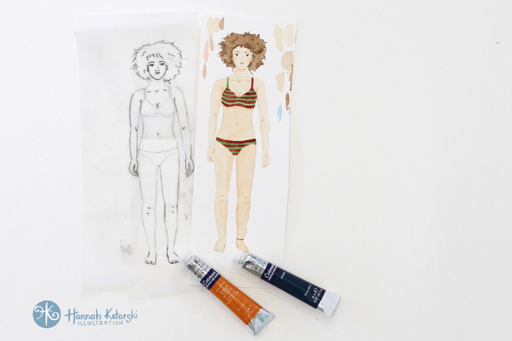 Black and white sketch and the finished doll. Keep facial lines simple. Black and white sketch and the finished doll. Keep facial lines simple. 3. If you like, draw a bikini on your doll, so she is still wearing something when she’s unclothed. When you are happy with your design, go over the pencil lines with the black pen, so it is easier to see. 4. Now that you have the doll, you can use this as a template for drawing the clothes. Tape your tracing paper with the doll to a light box or to a bright window. Carefully tape the edge of the watercolour paper over the top so you can see your doll through it. Now draw an outfit straight onto your watercolour paper, or draw it onto a fresh sheet of tracing paper if you’ll need a few goes to get it right. The outfit can be bigger and wider that the doll but not narrower. 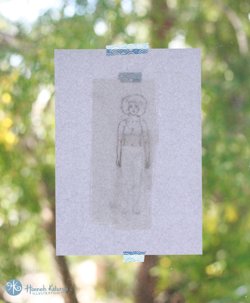 Tracing sketch using a window If your doll has its hand on its hip, you may need to include the hand on each new outfit. Once you finish an outfit, move the watercolour paper to align the doll with an empty spot so you can draw your next outfit. Drawing wetsuits are super easy. You could also draw your fave holiday outfit, swimmers and post surf kit, wintery clothes, and evening wear. 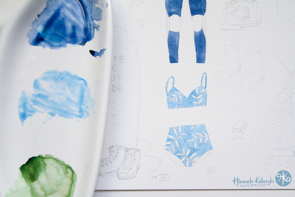 Painting outfits. 5. On each outfit, draw tabs that will fold over and hold the clothes onto the doll. They need to be long enough that they can wrap around. One on each shoulder and a couple near the waist or hips is usually enough. Why not draw some accessories, like your dream surfboard? 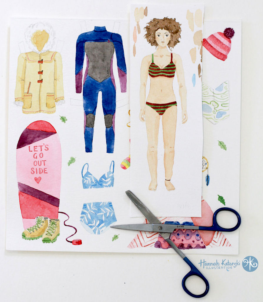
6. Using the window again, trace your doll onto watercolour paper. If your outfits are on tracing paper, transfer those too.
7. Paint the outfits using your preferred supplies. You can even use coloured pencils or markers, or a combination. You may like to ink the important details with the waterproof pen and erase your pencil marks before painting. When painting, wait for one area to dry before painting next to it. This will stop colours bleeding into each other. 8. When everything is dry, cut out your doll and outfits with a pair of small, sharp scissors. Don’t forget to keep the tabs attached! These paper dolls make wonderful gifts or keepsakes from an adventure. When you complete the project, share your paper doll with @mermaidscoin and #surfgirlpaperdolls on instagram. |
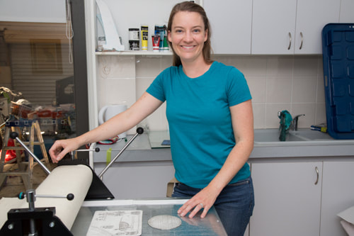
WELCOME TO MERMAiD'S COiNSurf Artist, Hannah Katarski is based in Fremantle, Western Australia. She creates ocean-inspired art that is bohemian, retro and fun. Categories
All
Instagram @MermaidsCoin |
 RSS Feed
