0 Comments
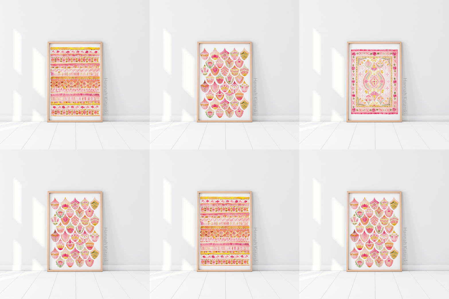
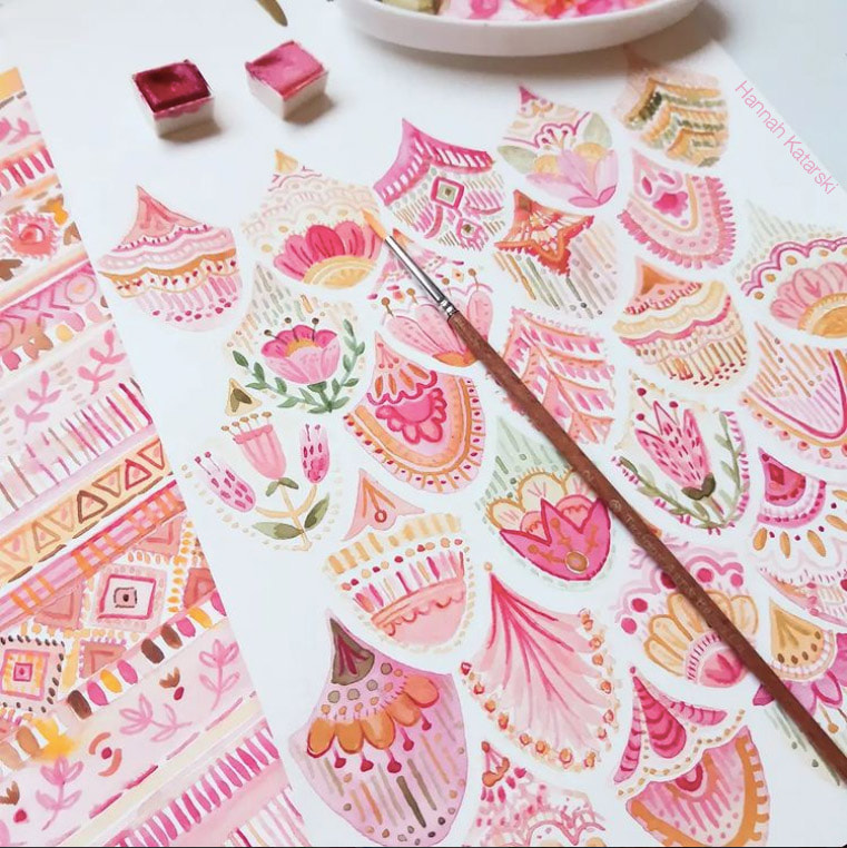
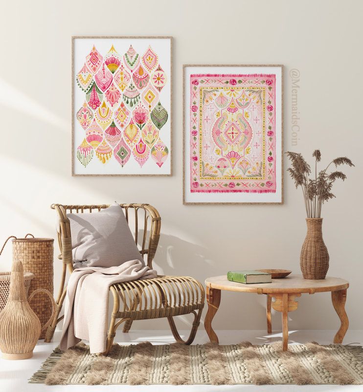
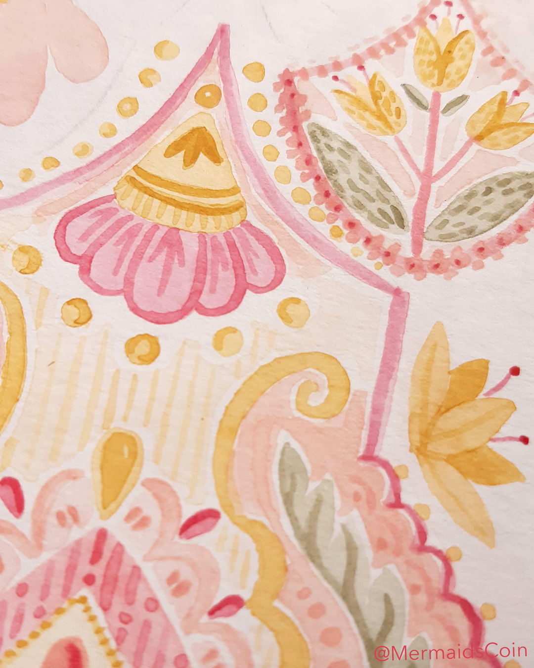
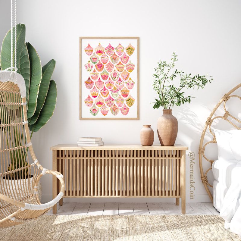
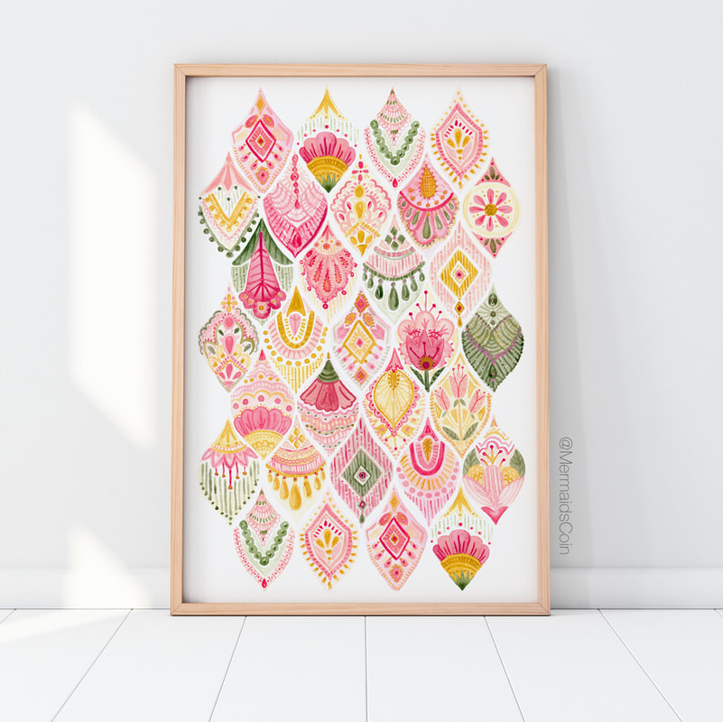
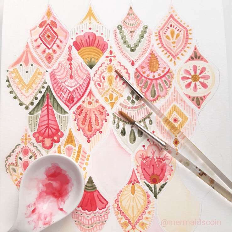
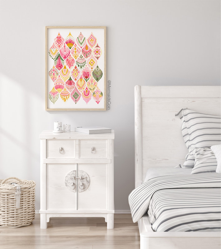
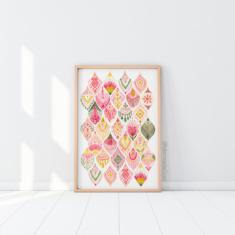
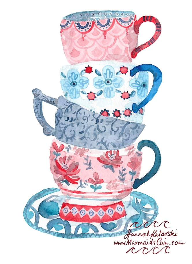
I am excited to share my new collection of four pretty, pink prints!
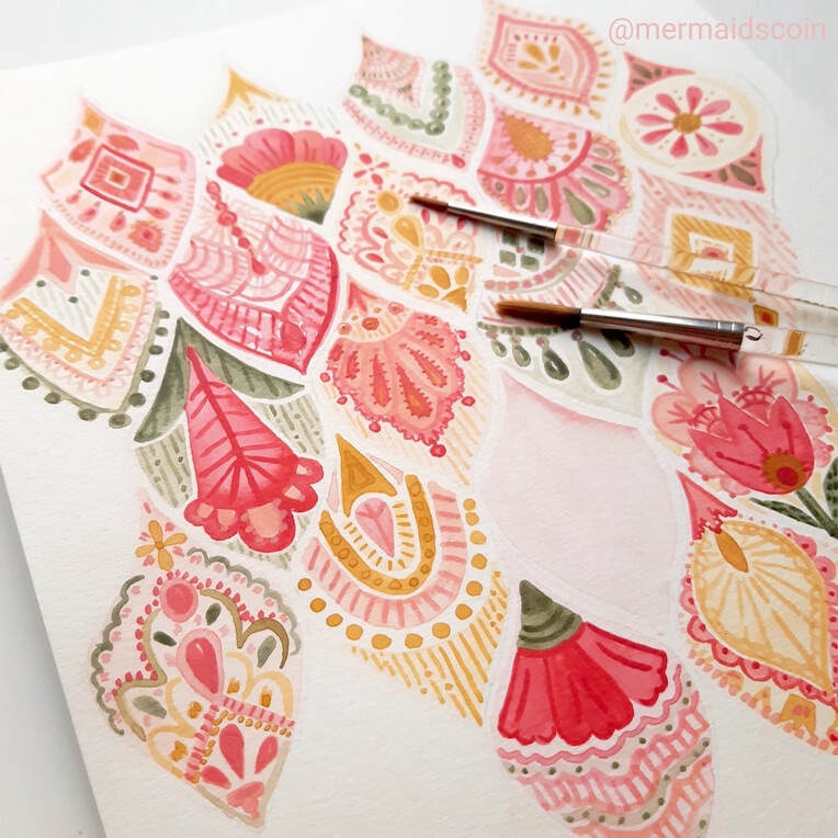
I have loved painting this collection. I started off painting the woven pattern and then moved on to the scallops. It was really freeing to have a repetitive structure and then be able to try new things in each shape or line. I've been inspired by lace, beading and antique chintz, theatrical costumes and colours of Venetian glass. I'm so proud to launch my latest print, Parisian Summer. I am really enjoying exploring this idea. I've been inspired by lace and antique chintz, theatrical costumes and colours of Venetian glass. This artwork is printed at museum grade quality and available in US and European sizes, from 8x10" and A4, all the way up to 70x100cm!
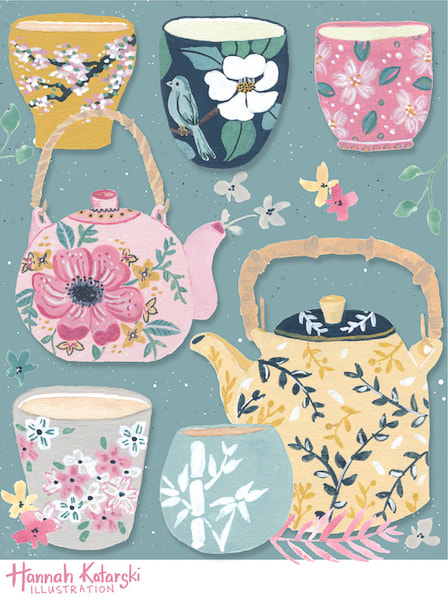
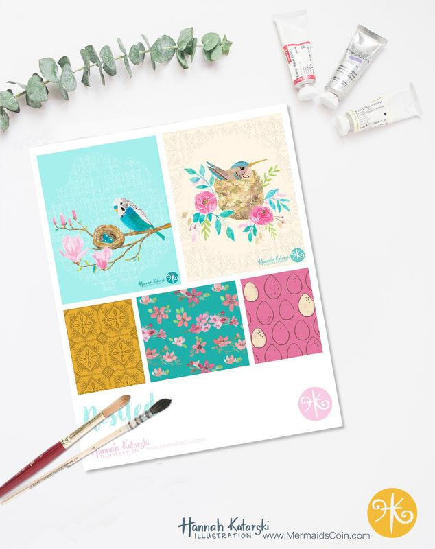
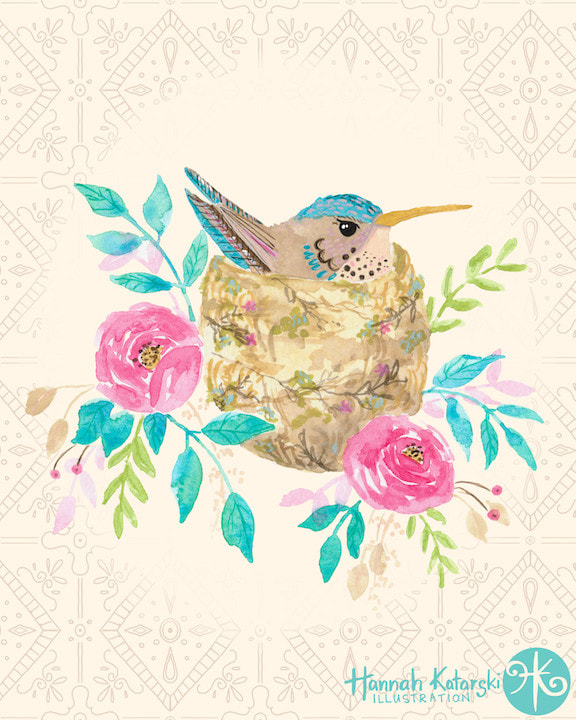
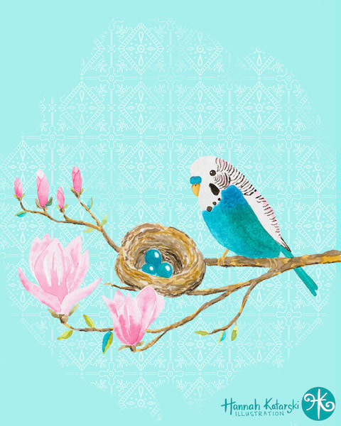
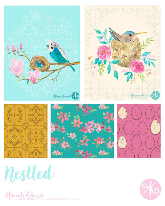
I love taking online classes. Victoria Johnson's are some of the better ones I've done. She provides succinct, useful information and then great briefs from which you can launch into new work. The classes aren't about learning techniques, but building concepts and ways of thinking. Her Create Collections class got me thinking about leveraging all the ideas I have to create a small series. This is far more efficient than creating five unrelated illustrations. I do love working this way, because sometimes I feel this need to include all my ideas in one design! I don't want to leave anything out. A series allows you to explore as many as your ideas as you want to. For this collection, I combined florals and something new to me - birds. It was great to take on a new challenge an fun to create some simple coordinates to fill out the mini-collection. These designs are all available for licensing.
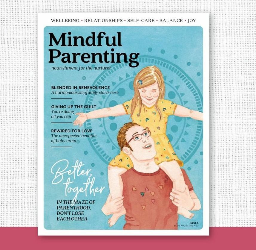
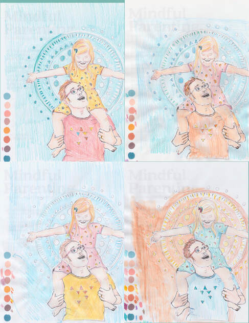
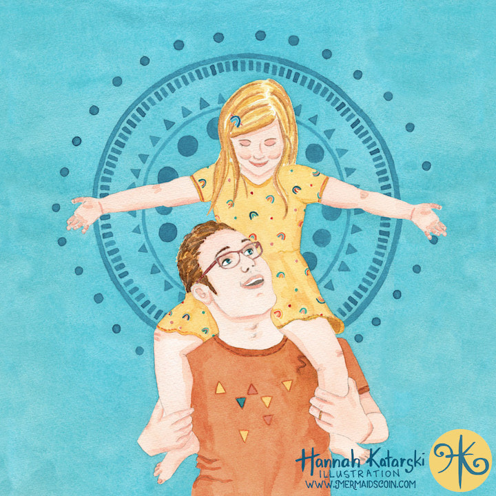
Last year I finally took the plunge. I had been building my illustration portfolio for maybe a year, and was getting prepared to start approaching art directors. The first market I was going to try my hand at was editorial. This can be book covers, magazine covers, spot illustrations... the kind of artwork that accompanies text. So I had been adding artwork to my portfolio that included people and children, in order to show that I could do the work. I wrote my email pitch and started introducing myself. I tried to keep my hopes realistic. After all, it's not like someone was going to get me to do a cover, but hopefully a couple of spot illustrations would come my way. The very next day, I got an email from Mindful Parenting Magazine. The artist they had lined up for the next issue was unavailable and would I like to do it? YES! I would! They send me a fab brief and a contract and I got to work creating some concepts. Once they had chosen their preferred sketch, I created some colour roughs for them before painting the final artwork. Lessons LearnedThis was such a dream project. I also learned some lessons along the way. Communication is key and art directors and designers need to see what is in your head as much as possible. This is always difficult with painting, when the only way you can really show what the artwork will look like is by painting it! For this project I created colour roughs with coloured pencil. I have also created them digitally, but for subsequent projects I'll be creating thumbnail colour roughs using paint. Thumbnails are small sketches with minimal detail and therefore faster to complete, while still communicating colour and feel. Colour pencil didn't communicate the saturation or texture of watercolour. I have tried digital roughs but then need to mix my paints anyway. The added bonus of using paint is that when I get approval, my colour mixes are ready to go. This image was licensed exclusively in 2020, while that issue was new. It is now available for licensing.
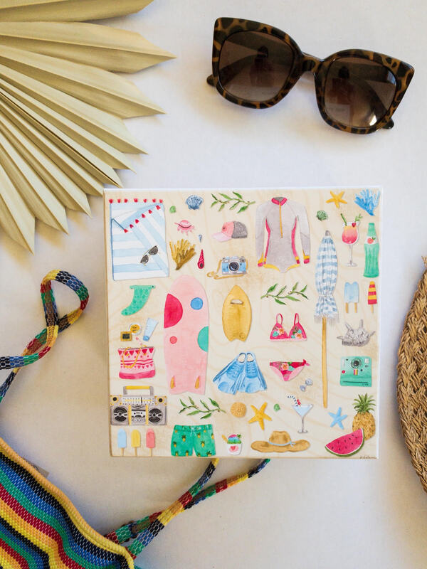
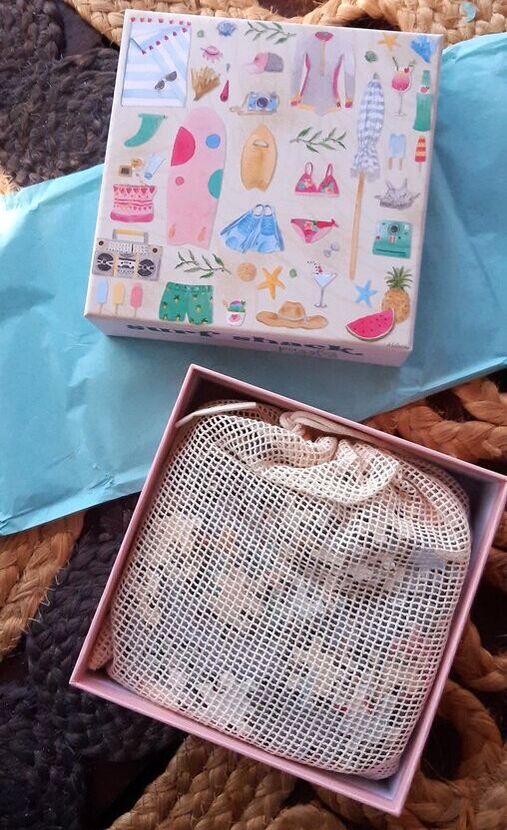
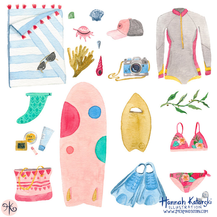
At the beginning of 2021 I had a list of goals for the year. One of them was to get my work on a jigsaw puzzle. I'm unbelievably excited to share my latest collaboration with you! "Beach Essentials" from Surf Shack Puzzle Co. This was a match made in Heaven! Owner, Mahina is a fellow surfer who started Surf Shack Puzzles last year. I approached her about working together and she was full of wonderful ideas. This first puzzle was an adaptation of an illustration in my portfolio. I painted some additional icons to add more detail to the puzzle. Mahina was wonderful to work with and I love that she promotes female artists across the world. Surf Shack Puzzles are made from recycled materials, come in plastic free packaging and are printed with non-toxic inks. I created the elements with watercolours before scanning them and tweaking the arrangement in Photoshop. I kept to a colour scheme in order to make everything coordinate. (I talk all about this in my online class.) 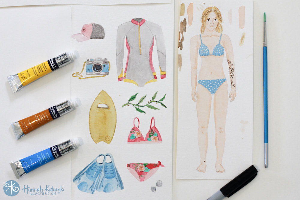 I just love that there are so many avenues for illustration to find its way onto products. My second design will be launching with Surf Shack Puzzles a little later in the year. Sign up for my newsletter to be the first to hear about it.
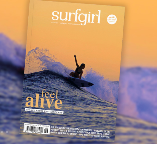
I'm so excited to be included in this month's SurfGirl magazine! I copy arrived in my letterbox and it looks beeeeyoootiful! I've written a tutorial for creating your own quiver of surfy bookmarks.
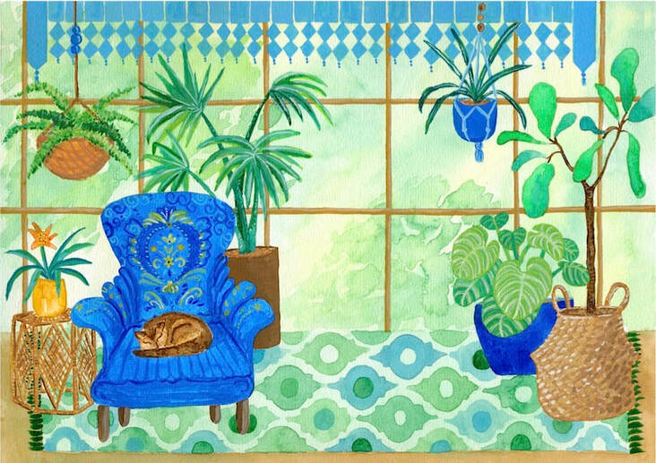
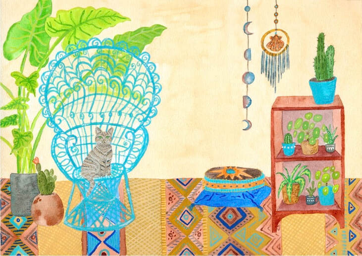
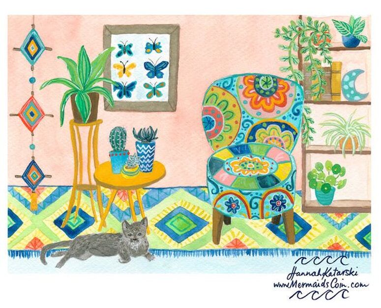
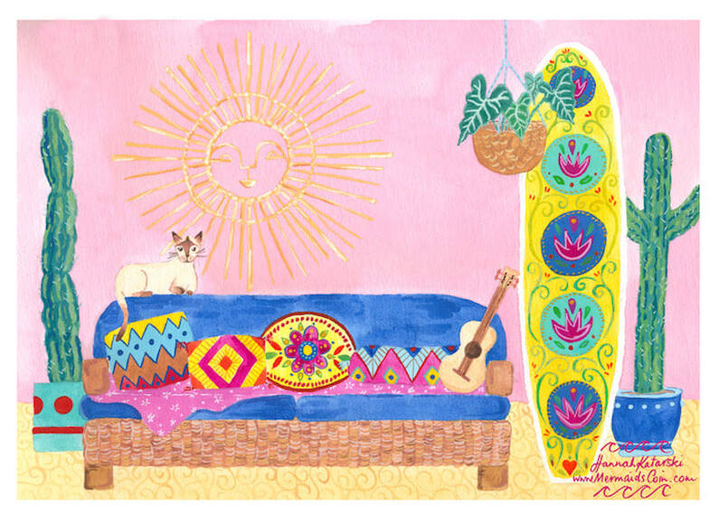
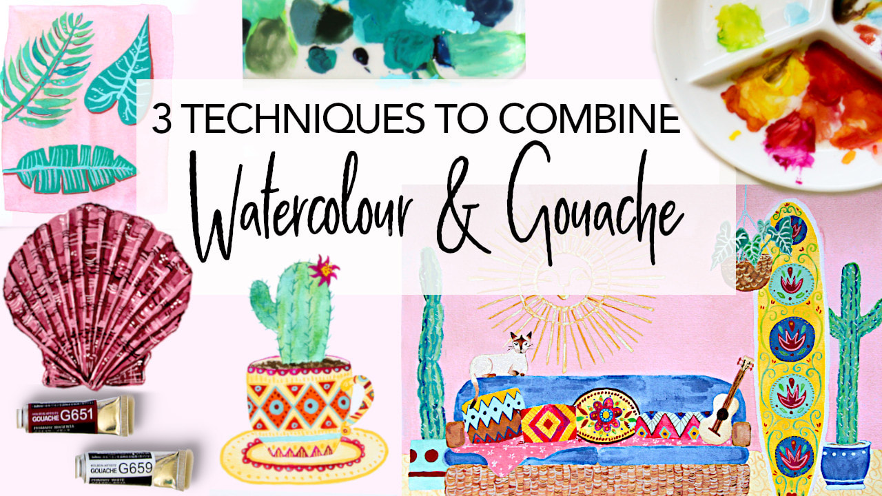
I was also interviewed for the SurfGirl website and you can also see me painting over there too! Check it out the interview here: https://www.surfgirlmag.com/2019/12/speed-painting-with-mermaids-coin-art/ Hey! I wanted to share my fresh prints! I recently completed this series after starting the first one as a class demo. This is my first series of work combining watercolour and gouache together. It was a big learning curve and I really enjoyed being a stylist - decorating each room and deciding on a colour scheme for each one. Which one is your favourite? These illustrations are now available as A4 prints and as a 4-pack of greeting cards in my Etsy store next week! Do you take online classes? What's your preferred platform?
If you're interested in learning how to paint you own boho bungalow, or about using gouache and watercolour together, check out my Skillshare class! You can sign up for 2 free months and watch a load of classes for free. Over the last six months I have been working to build up a portfolio of watercolour work available for licensing. Now that my website overhaul is finished I'm happy to launch this new part of my business. I'll be uploading lots of beach-inspired repeat patterns and illustrations over the coming months. View my portfolio.
|
WELCOME TO MERMAiD'S COiNSurf Artist, Hannah Katarski is based in Fremantle, Western Australia. She creates ocean-inspired art that is bohemian, retro and fun. Categories
All
Instagram @MermaidsCoin |
 RSS Feed
